Branding | Illustration | Editorial
PGIM Illustration
Rebrand
Overview
My role at PGIM on the Creative Studio team consisted of designing for the editorial vertical as well as for large, omni-channel campaigns and brand initiatives. PGIM’s 2025 rebrand was a reset and realignment to create a stronger, more cohesive connection to the larger organization, Prudential. There are several layers of image types and use cases within the rebrand. I was tasked with the refresh of the vector illustration library, which is a system used primarily for data storytelling throughout whitepapers, social, and display ads.
Problem
PGIM underwent a brand refresh to be more aligned visually across lines of business within the organization as well as to be more connected with Prudential’s overarching brand system. The illustration refresh needed to be simplified, refined, and nimble enough to communicate a variety of topics.
Role
Designer responsible for illustration concepts, execution on editorial and social assets, and creating a library for team use.
Process
Research
Brainstorming
Design
Iteration
Delivery
Solution
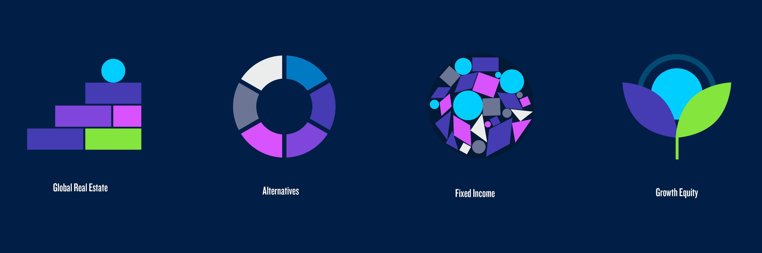
A visual system based on the circle, mimicking the shape of the rock in the PGIM logo. The vector illustrations are creating using only 4 colors from the brand palette creating consistency and cohesion. A flat, geometric, minimal approach was taken to ensure concepts would be communicated in a universal way.
Tools
Illustrator
InDesign
Duration
This broad initiative occurred over the course of about 5 months. Illustrations for specific projects were executed over the course of about 1 week as needed.
The Before
The illustration library that I helped to create before the rebrand consisted of visuals with greater complexity in composition and color palette. The secondary brand palette was front and center and the cyan acted as a symbol of the organization, as the main character in the story describing the product or line of business.
Because of the complexities in color and use of more types of geometric shapes the illustrations reflected playfulness and approachability but might have been lacking in the sophistication and refinement that a financial institution strives for.
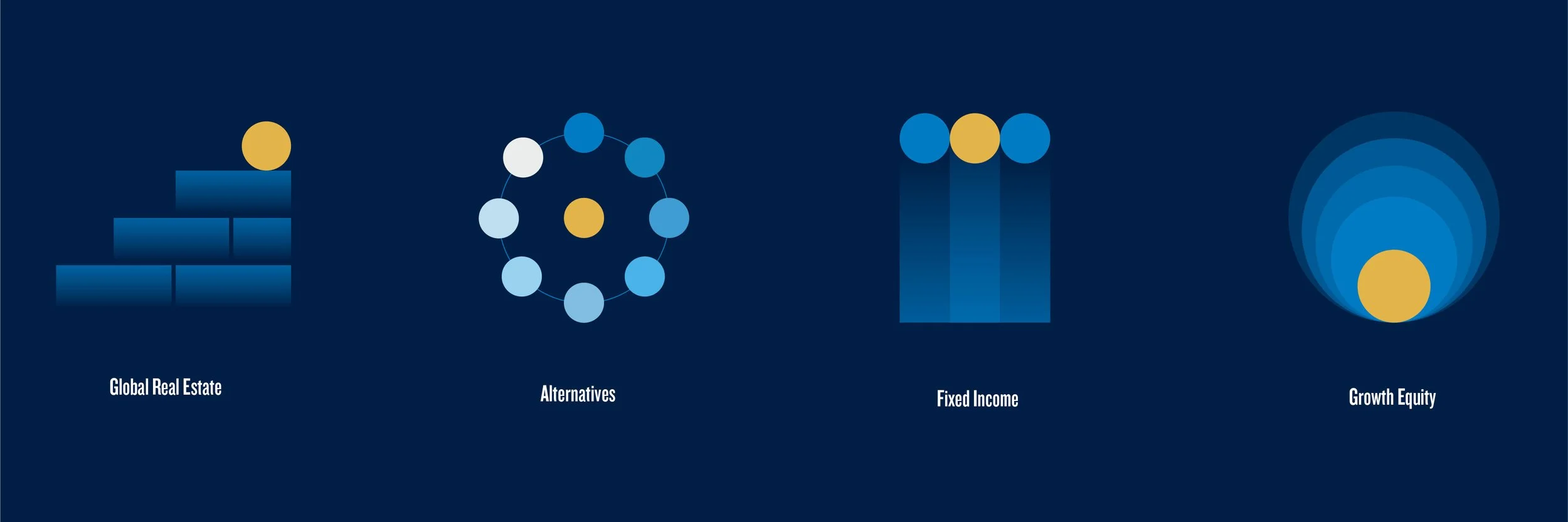
The Rebrand
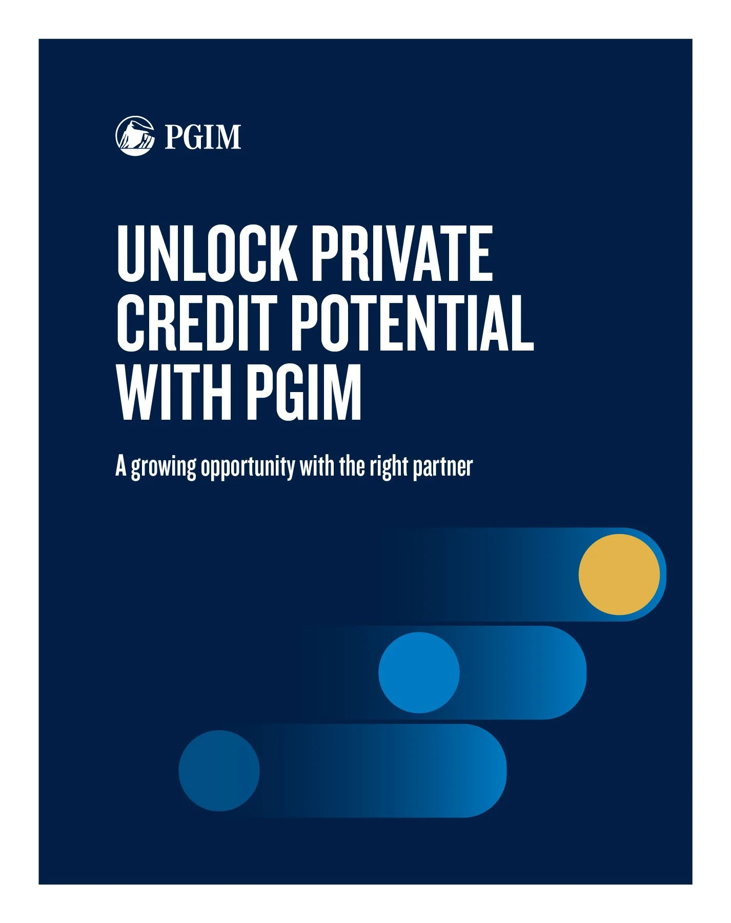
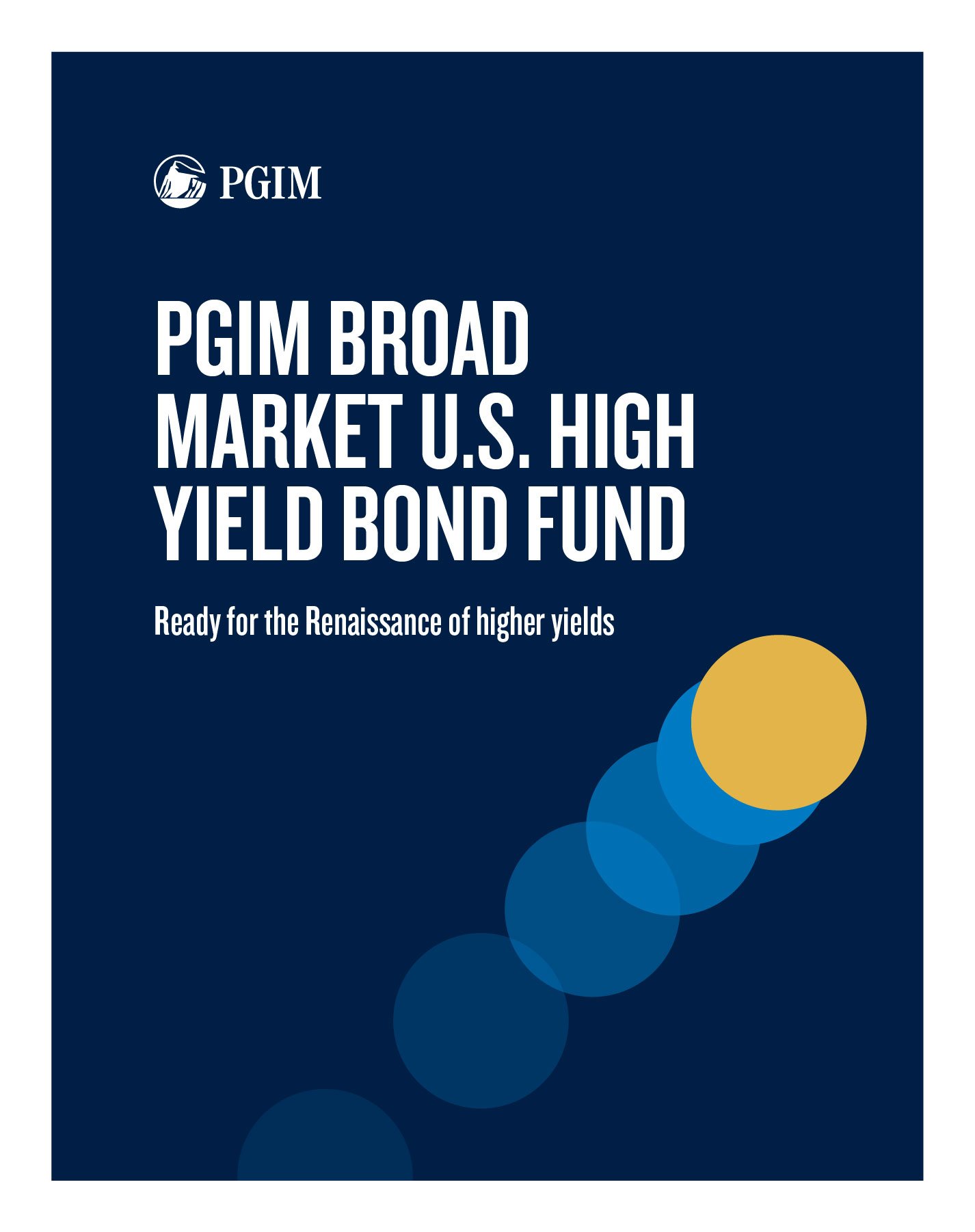
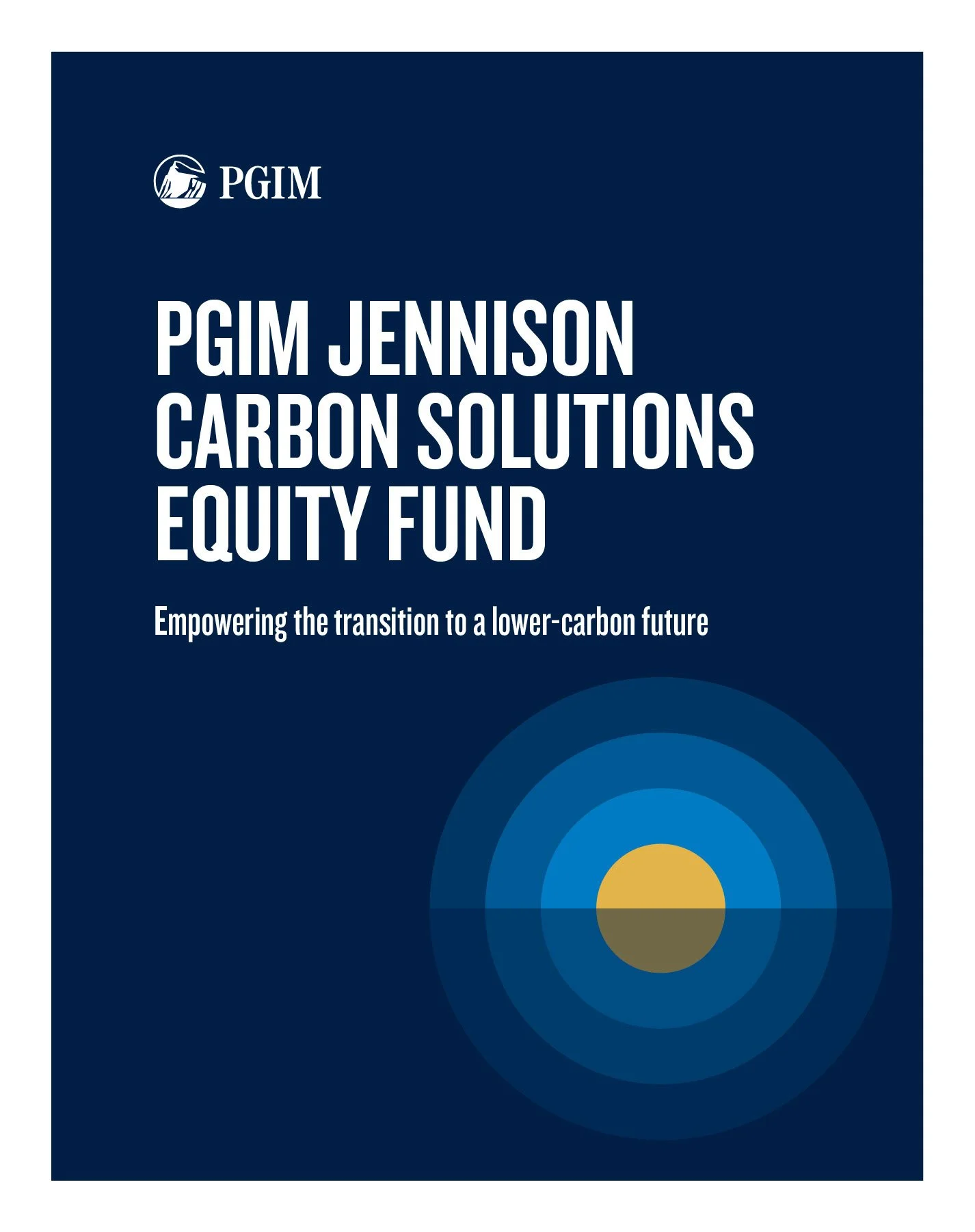
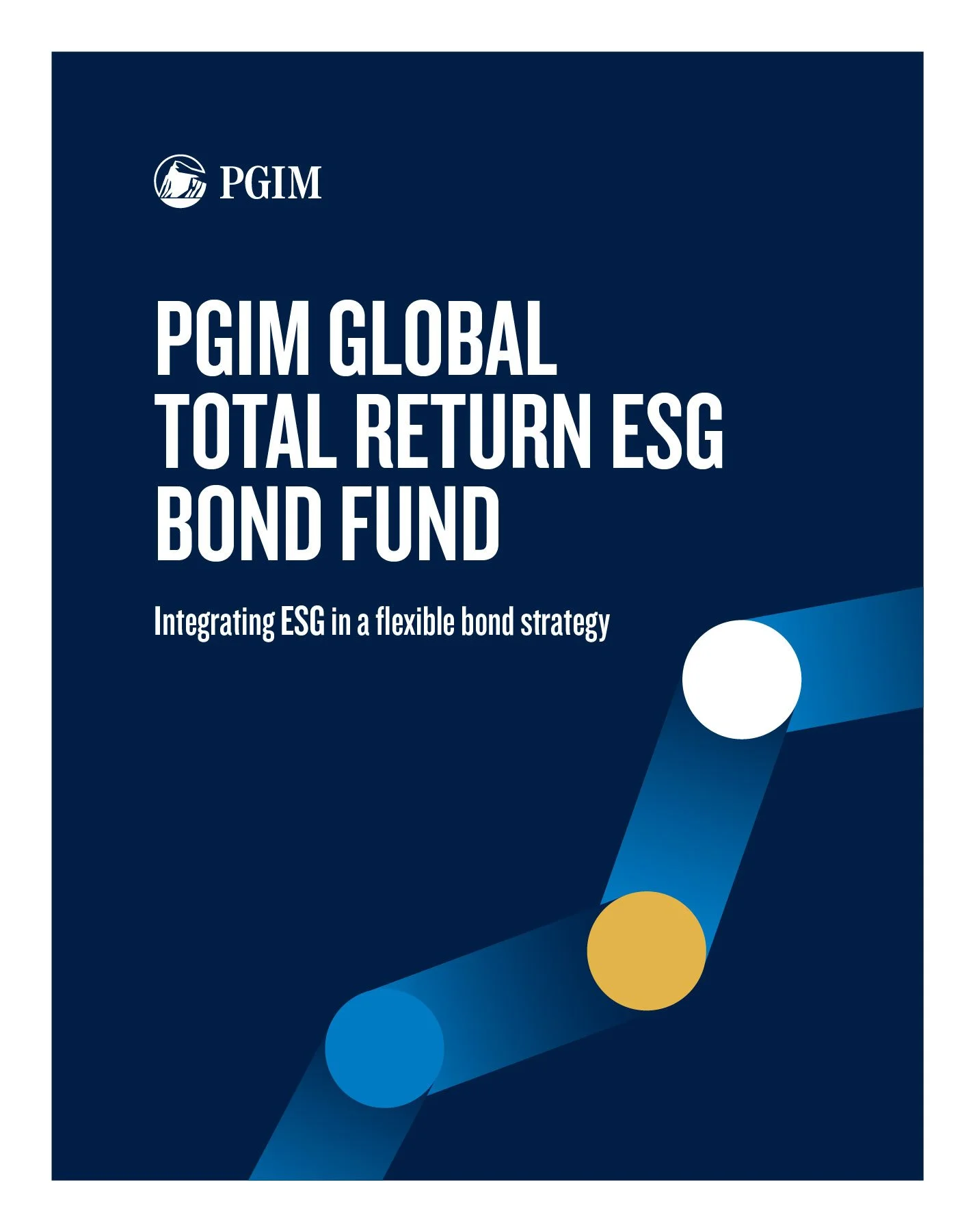
The revised illustration library is simplified to reflect a minimal palette and a smaller amount of different shapes resulting in a visual language that is versatile and scalable across multiple touchpoints. It is flexible, but also true to PGIM’s brand identity. Designing within a more structured set of rules was a challenge but also reinforced cohesion across themes.
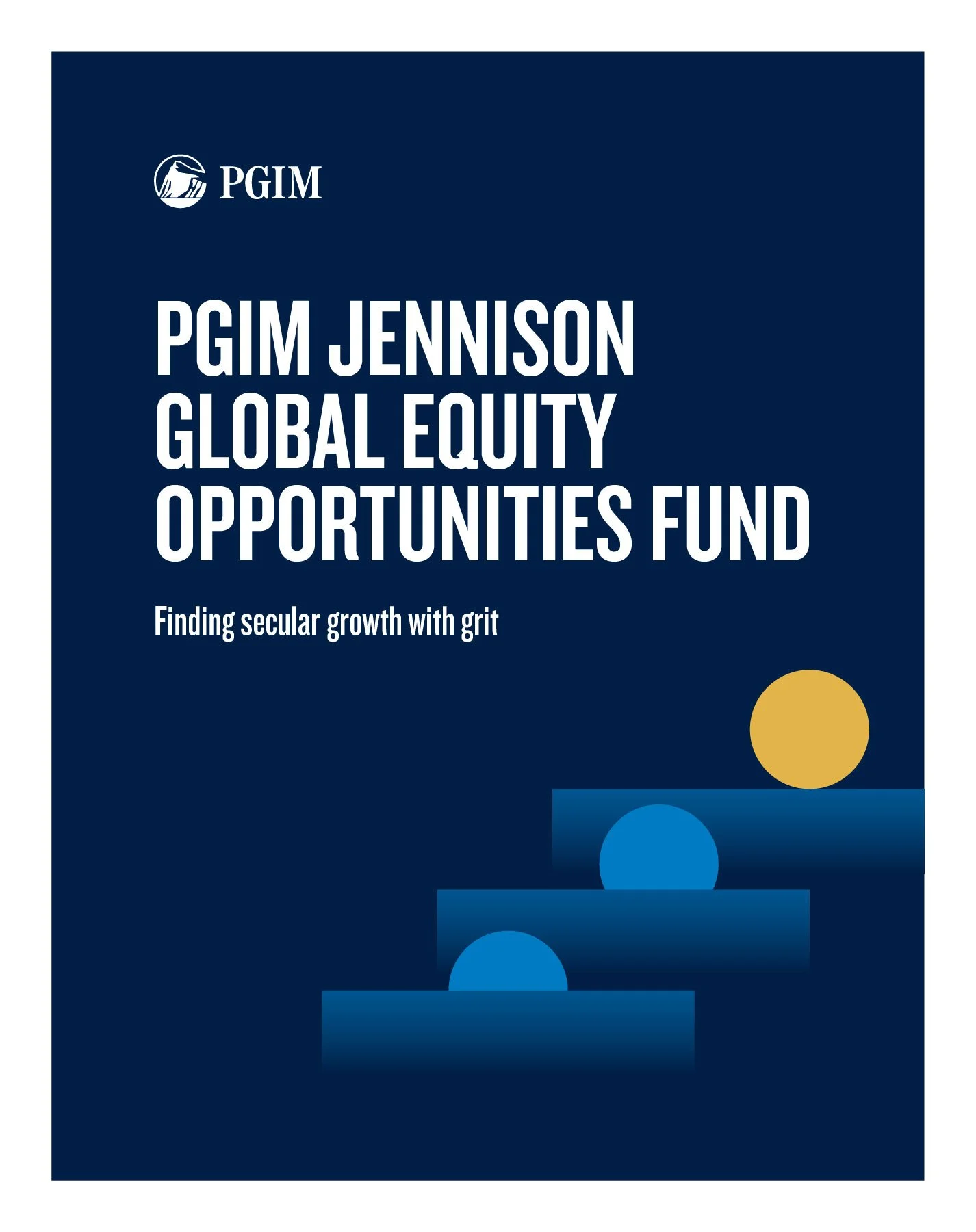
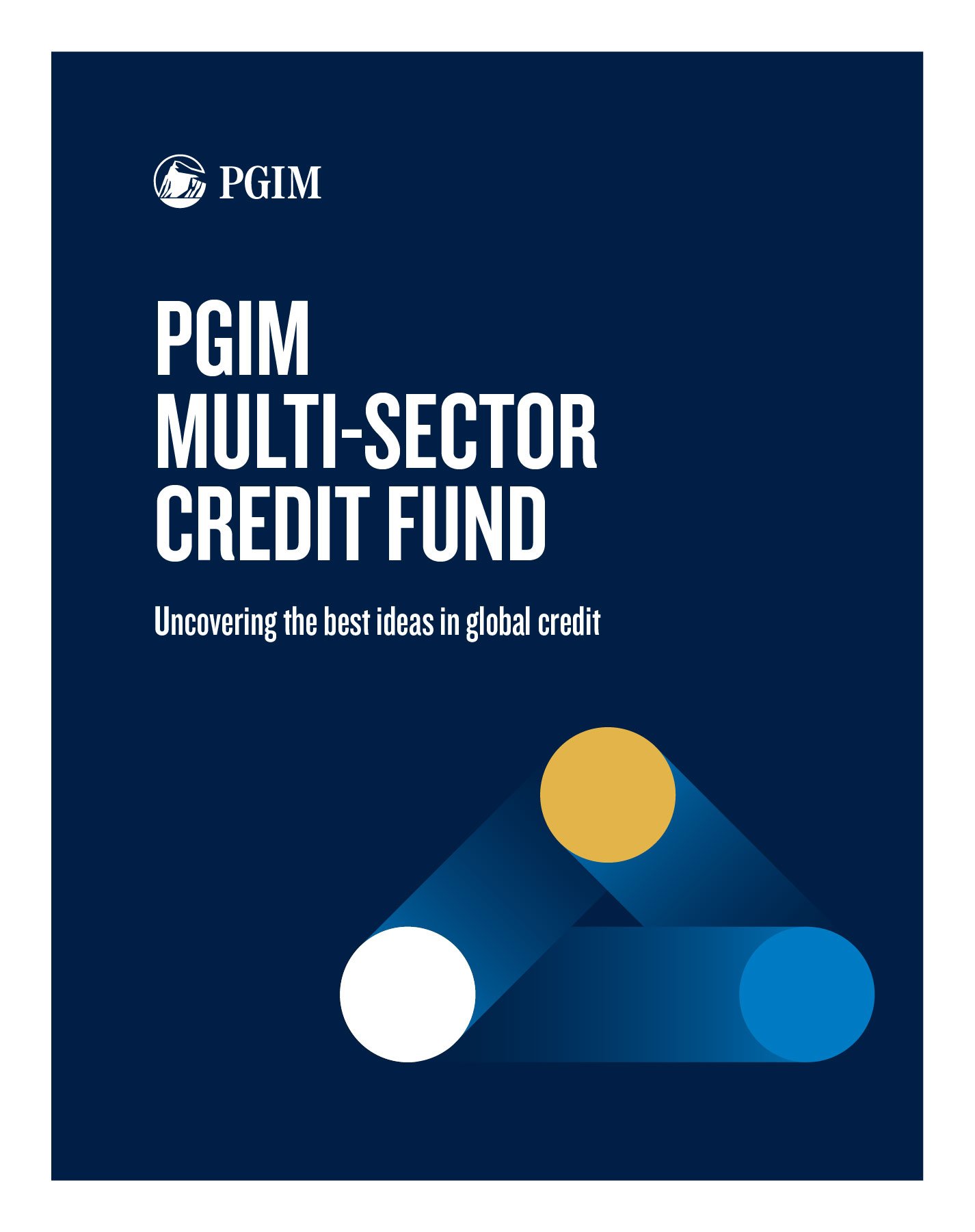
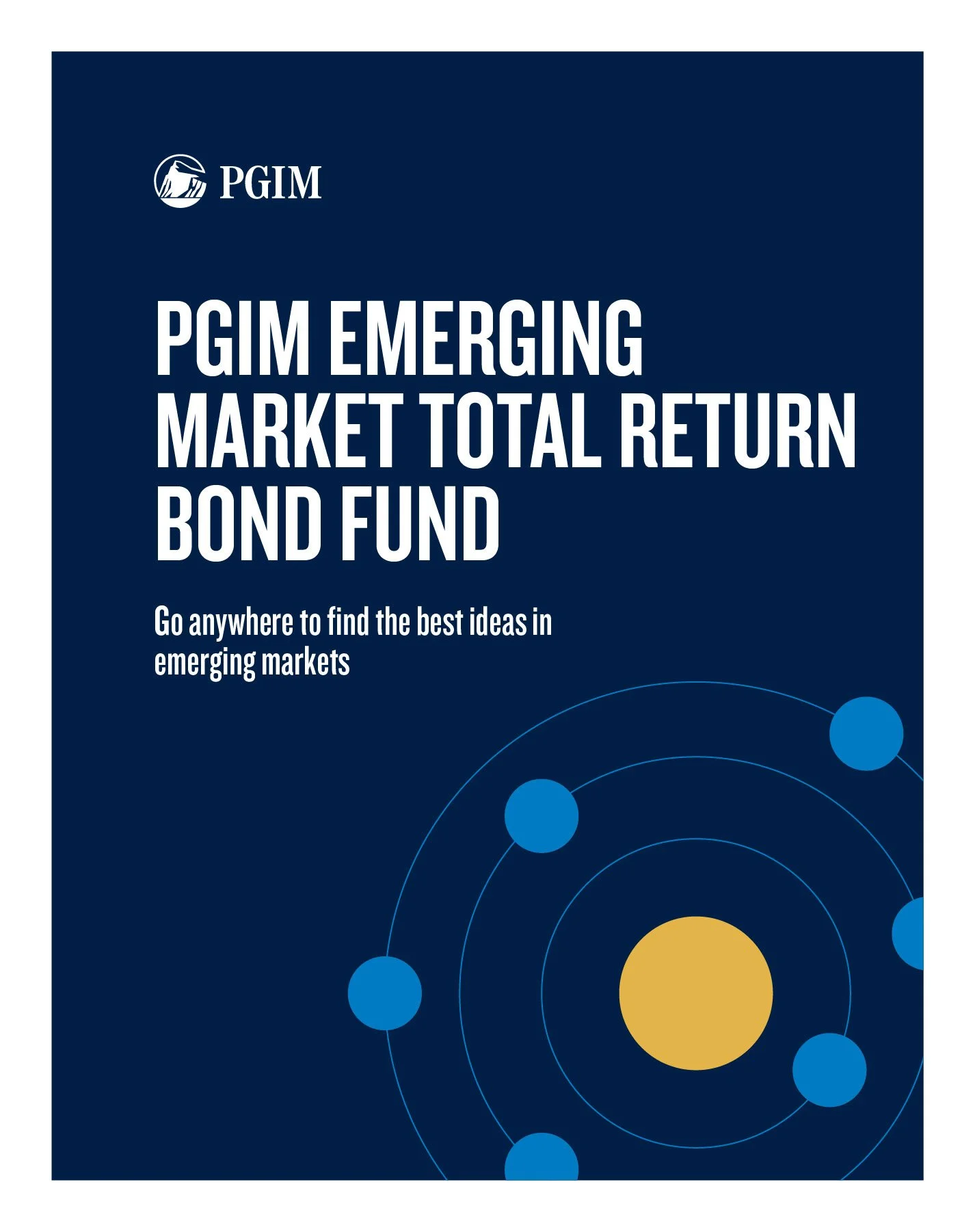
Blue, navy and white are used as the primary palette, the gold acts as a highlight to call out the outcome or main point to be communicated within the illustration. This tier of the brand imagery guidelines is used in data storytelling in editorial pieces like whitepapers and digital assets like social posts and display ads.
Editorial Design
One of the main channels for the illustrations to be implemented is in data driven editorial pieces like institutional whitepapers. The illustration that communicates the theme of the headline and sub headline is placed in the lower right quadrant of the layout providing visual balance with the bold, all caps typography in the upper left. The interaction with the edge was also an important aspect to placing the illustrations into layout, cropping occurred if it visually supported the story they were telling a bit better.
The illustrations, created in Illustrator, were placed into InDesign to create editorial pieces like the examples shown here or into Adobe Express social media templates to describe data stories in the digital, mobile-first space.